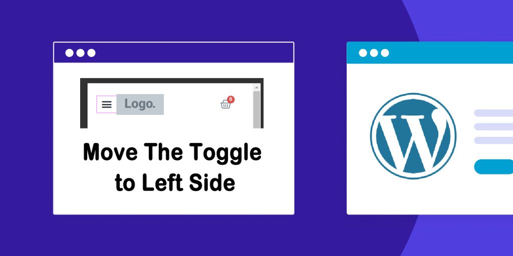
If you build your website with the Elementor page builder, when you set up the mobile device responsive WordPress, the menu toggle (hamburger icon) will be displayed on the right side of the site logo as the below example screenshot shows
To improve its appearance, we can move the menu toggle(hamburger icon) to the left side of the site logo.
In this article, we will introduce how to move the hamburger icon to the left side of the site logo for your responsive mobile WordPress website.
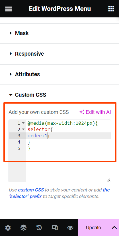
Step 1. Edit the header top menu in the Elementor page builder,add Custom CSS to the menu toggle icon
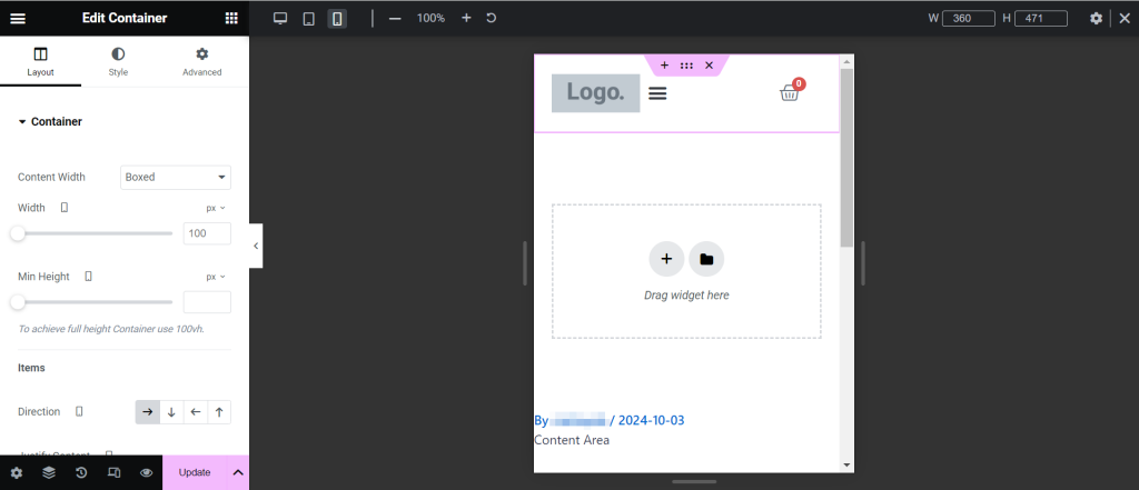
We assume that you have already adjusted the header menu inline as the example screenshot shows.
-
- Click on the menu toggle (hamburger icon), go the the Elementor editor section, and click the Advanced Gear icon to edit the menu toggle.
-
- Scroll down to the Custom CSS.
-
- Add the below snippet to the Custom CSS
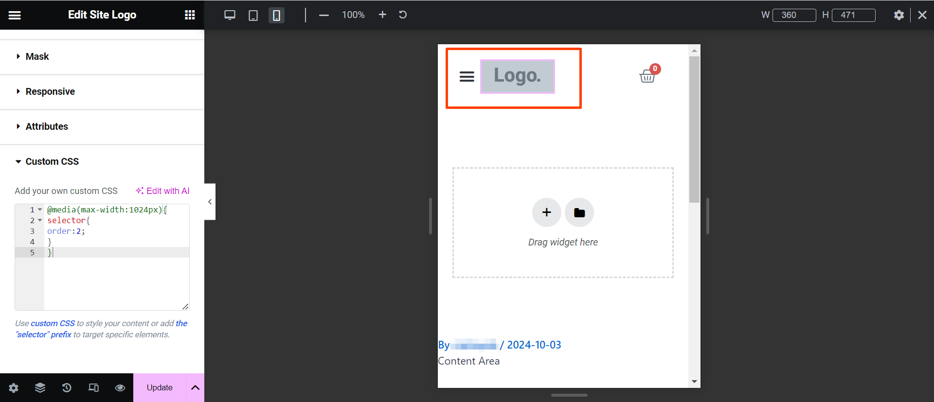
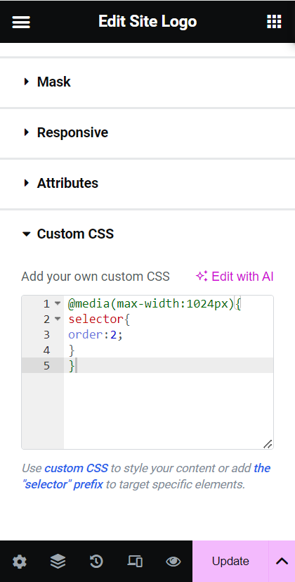
Step 2. Add Custom CSS to the website logo
- Click on the website logo, go the the Elementor editor section, and click the Advanced Gear icon to edit the website logo.
- Scroll down to the Custom CSS
- Add the below snippet to the Custom CSS
After adding these snippets to both the toggle icon and the website logo. The position of these 2 widgets has been exchanged.
See what it looks like :